Slopes Diaries #26: Killing the Slopes Pass
Slopes Diaries is my ongoing journey to turn my indie app into a more sustainable part of my business. First time reading? Catch up on the journey so far.
What is Slopes? Think Nike+, Runkeeper, Strava, MapMyRun, etc for skiers and snowboarders.
Last post I talked about how I spent a lot of time over the summer focusing my business efforts on my IAPs to ensure I was offering the most compelling line of IAPs to my customers, with the goal of attracting more free users to upgrade.
While all that was going on I realized it was time to really lean into something I started over two years ago: fully embracing the consumable IAP aspect of my business. I started the initial reboot of my business model by focusing on subscriptions, but since adding consumables, they now account for 75% of my sales (sales, not revenue). They greatly help to address large parts of my market for which a subscription just doesn't make sense. They aren't my big cash-cow, but they are not trivial (and I'm hoping to grow them more this year with the new bundle).
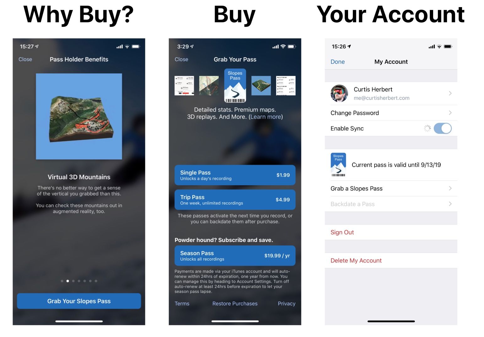
However there was a big roadblock to fully embracing my consumables: I was still calling my paid offering the "Slopes Pass." This made sense when the core idea was a subscription akin to a season pass at a resort, but it had been really muddying the water as I tried to market it in the light of all these consumables. All the in-app marketing I did, while I had touched it up a bit, was designed and developed while my sole focus was that subscription.
I was missing a lot of clarity.
Fortunately since I launched Slopes 2.0 in 2015, premium unlocks inside of apps have become more and more popular, especially subscriptions. So I feel I don't need to rely on calling my annual subscription a "Season Pass" (which in my niche came with loaded meanings, such as it only being valid Nov - March, not one calendar year, which I know lead to occasional confusion and likely lead to a loss of sales) just to help people understand it.
Enough things had changed in the landscape of IAPs that I felt I could experiment with pushing reset on my branding of my premium features.
So for this season the "Slopes Pass" is dead.
Enter "Slopes Premium" where you "buy a pass" (whatever kind it is: day or annual) to go premium.

A Premium Redesign
I've you've been following me on Twitter, you've likely seen a lot of this come together over the last two months as I tweeted out my various WIP designs. I reworked all of my branding in-app from the ground up to not only fully embrace the consumables, but also to better convey my premium offerings as a branded item "Slopes Premium."
Lets take a look at three key screens as they originally existed:

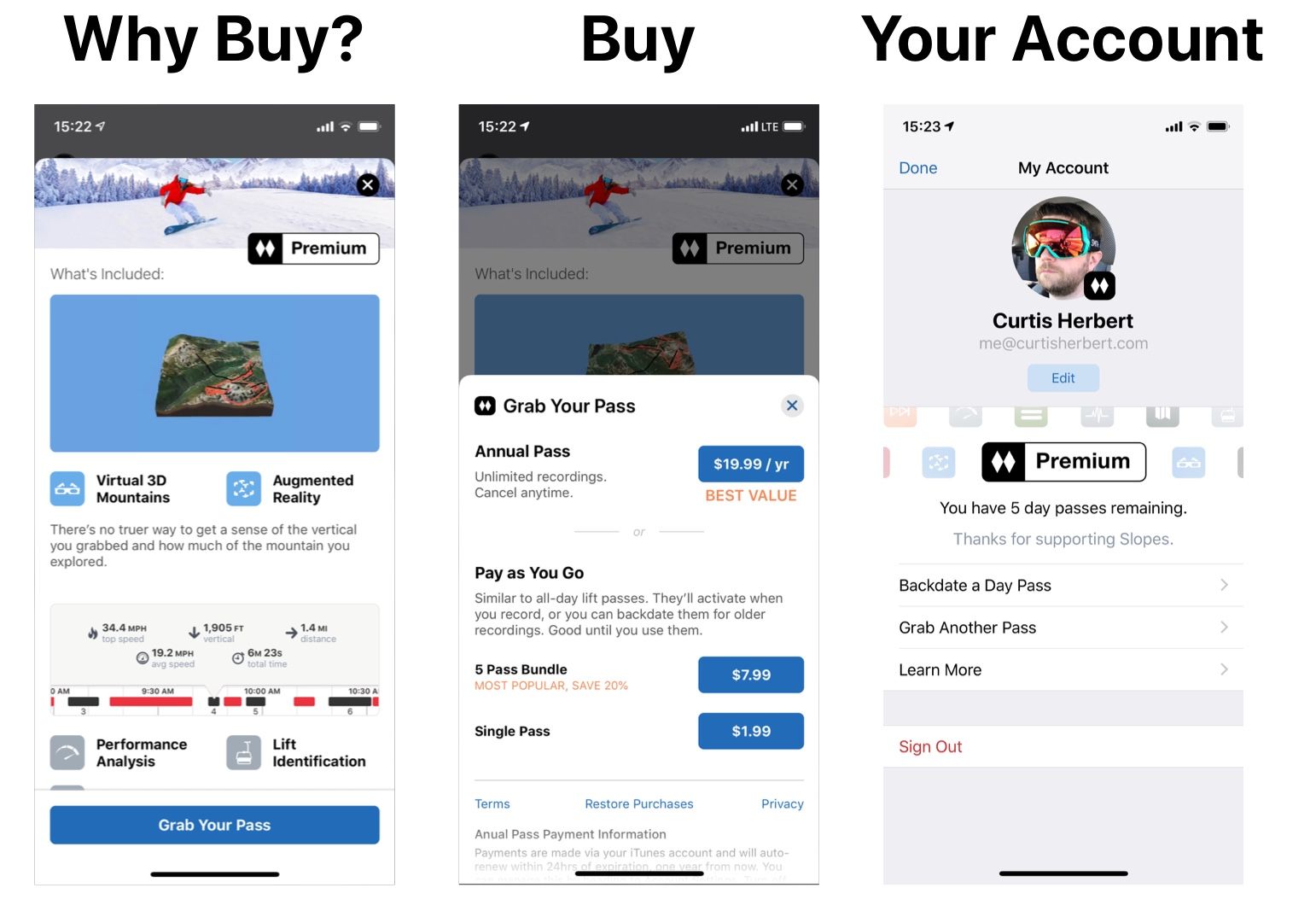
...and how they look now:

My main goal was simple: stop saying so much! In all my of A/B testing of various copy last season it was clear that the shorter / more to the punch I could make any call to action or marketing text, the better it would convert.
With that in mind I focused on making the Why Buy screen much more scannable than the old one. Not only did I ditch the pager, but instead of calling out features in paragraph form each feature now has its own icon and bold title, and they were grouped by commonality. I only rely on the paragraphs for some supporting flavor. All this makes it so much easier to scan through and quickly see you get a ton of features with premium.
The Buy screen rework focused on making the purchase decisions much easier to understand (in presenting them as a "subscribe or pay as you go", not three products), and then making sure I was calling attention to the IAPs I want users to focus on (annual followed by the bundle).
Both of these screens were using a new card library I wrote to make the screens feel a little less disruptive (I can pop over the buy screen without obscuring everything) and easier to dismiss.
Lastly, the your account screen is representative of everywhere else in the app premium is referenced: strong iconography and bold fun colors, drawing attention to the area. Using the premium logo (the double diamonds) anywhere the user avatar is shown, too, to help them feel "part of the club" if they have a pass on their account.
Closing the Gap
In the past I've talked about trying to make sure I take every opportunity to upsell, and boy had I missed a lot! As part of the redesign I knew I needed to do a full pass on my app looking for all these gaps and doing what I can to improve my sales process.
I had a few goals in mind:
- Keep the same focus I had on the premium screens above: make it brief.
- Keep it compelling: the colorful premium banding above helps, but make sure I'm also using the user's content to my advantage.
- Keep it easy: don't make users jump to a specific part of the app to buy premium; make it available inline where they are being told they need it so they can just grab it and keep moving.
- Keep it contextual: anticipate what the user wants to do when faced with the need to buy premium to unlock something. If they've bought before, just take them right to the buy screen, skip the "Why Buy" upsell. If they have a pass on their account make it easy to use that pass to unlock a day without having to hop to the "my account" screen or something.
I think one screen that is emblematic of the improvements seen by all of the above is the screen you see when you go to view your lifts and runs but don't have premium:
I will be honest: I was a bit hesitant on teasing the user's content like that (the part where the screen goes black before the card comes up), but I think it will be effective. My theory is that it isn't just a tease, I'm showing that their content it just right there, if they grab a pass. Combine that with how I'm making it easy to grab premium, via the new bundle, the process of unlocking their content feels like less of a commitment or headache.
The content never feels far away.
At least that's the theory. The rest of it is straight forward though: easy read and a primary call to action that is contextual (in this case they have an unused pass on their account, so unlocking the day is one tap away).
This ease of purchase / use is something I'm really focused on. With the new day pass bundle, I really want to encourage a "top off" mentality, where buying a pass doesn't feel like a big deal or commitment.
The process has to feel easy, if I want repeat purchases.
I'd encourage all of you to do a thorough pass on your own apps. I have a feeling many of you are like me: making your IAPs accessable (if the user knows where to go to get them, usually the about screen), but not selling as effectivly as you can.
It can be hard to make time for this focus: if you're like me you have a ton of features you're trying to get to, and something like this can feel less important. I downloaded a ton of apps over the summer to get inspiration for these upsell screens and I was unsurprised to see that the premium-upsell process for many apps was a clear afterthought. Dump the IAP in the "more" or "about" screen and let people seek it out if they want it. I think this works a bit better for subscriptions which are more of a commitment, but for me now with my consumables I needed to ensure users didn't have to seek out a way to give me money in the app, I had to just ask right there and then as much as possible.
Every barrier you knock down leads to better conversions, and I'm optimistic that all the work I put in over the last month will help mine this season.