Slopes Diaries #39: Risky Business
Slopes Diaries is my ongoing journey to turn my indie app into a more sustainable part of my business. First time reading? Catch up on the journey so far.
What is Slopes? Think Nike+, Runkeeper, Strava, MapMyRun, etc for skiers and snowboarders.
So that free trial idea I was toying with back in September? It launched, and I think it has been a success for Slopes. Like many things Slopes it seems to largely be affected by when in the season the trial is happening, but I seem to be around 65% conversion from trial -> paid overall for the season (higher than that in the early season, lower in the mid-to-late season).
Android is pulling the iOS numbers down a bit (the above % is for both platforms), but iOS has a ton more premium features, so I'm not surprised.
Regardless, it seems to be working well.
Of course implementing this trial meant revisiting my upsell screen again. After all, it had only been half a year since I last did that. 😅
I had spent time in Jan of 2020 simplifying my upsell process to be a single-screen (vs a feature list modal followed by a purchase options modal) since those usually convert better (and they do!). Then in fall 2020 I worked on visually simplifying this single new screen as my old one was a bit cluttered and didn't really have the room for all the free trial explainers required.
With all those changes, this is what the screen looked like leading into the 2020/21 ski season:
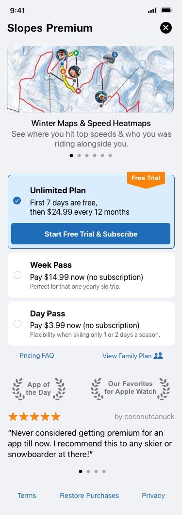
And I was pretty happy with everything. Considering how stubborn I am on keeping the Day / Week passes, I think this presents the lineup pretty cleanly.
This screen above is what got me the conversion rates I was talking about in the beginning. Doing pretty well, but I'm always curious where there is room for improvement.
In mid January a post made the rounds, "How Solving Our Biggest Customer Complaint at Blinkist Led to a 23% Increase in Conversion".
(go read that now for context, but TLDR; offer the user a push notification reminder on day 5 of a 7-day trial)
In it, Jaycee talks about how she changed their free trial screen at Blinkist to inform the user that they'll get a push notification reminder on day 5 of their 7-day trial reminding them of the trial and that they'd be billed soon.
In fact, the entire upsell screen they tested is dedicated to this flow:
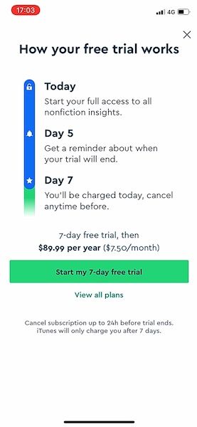
For Blinkist, the experiment was a huge success. The key stats from her experiment were:
- Increased trial sign up by 23%
- Reduced cancellations during the trial by 4%
I mean, these results are amazing, so of course I was going to experiment and see how it might work for Slopes. I set out to work and rolled out a version to production behind an A/B test flag one week later.
One hitch, design-wise: like I said I'm stubborn about keeping the Day and Week passes around, and I didn't want to hide them behind a "See all options" button making them second-class citizens. I could largely mimic Blinkist's flow (mention reminder, start trial, notification permission prompt after), but I needed to adapt the idea to work within Slopes's requirements. And ideally without a massive redesign, again (😅).
So this is the adapted flow I went with:
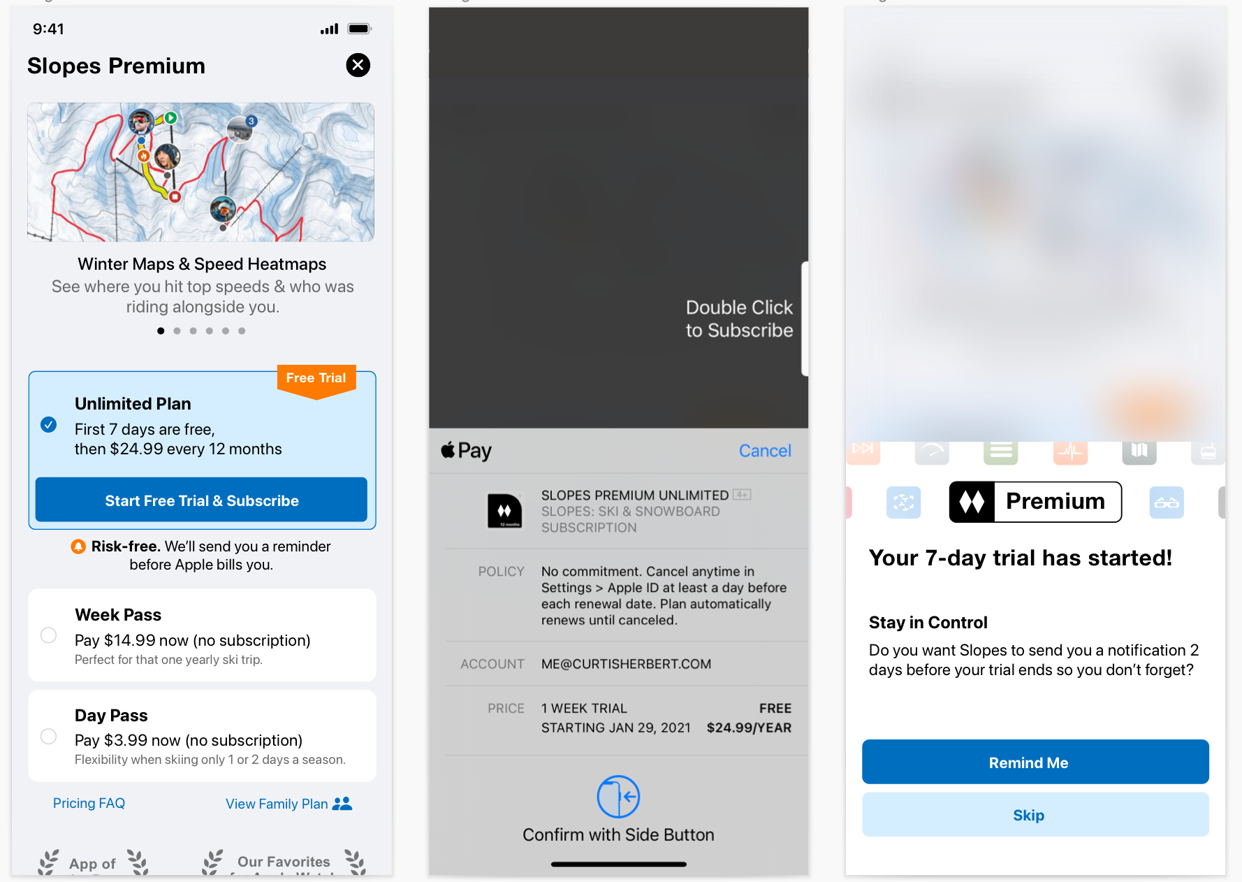
I do think that dedicating my entire pass-picker interface to be single-purposed to converting to the trial, a la Blinkist, would have increased the screen's conversion rate, but even with just this small change I saw a 4% increase in trial starts.
Not 23%, but still positive movement. Sadly Jaycee's article doesn't show what the screens / flow originally looked like before their test, so we can't see the full picture of the changes and what else might have added up to the +23%, but I'm def willing to say I'm shooting myself in the foot at least a little bit here. (After my go at this someone else tweeted they experimented with this and saw a 3% trial start increase too, so my number might not be way off base actually?)
But anyway, so far so good.
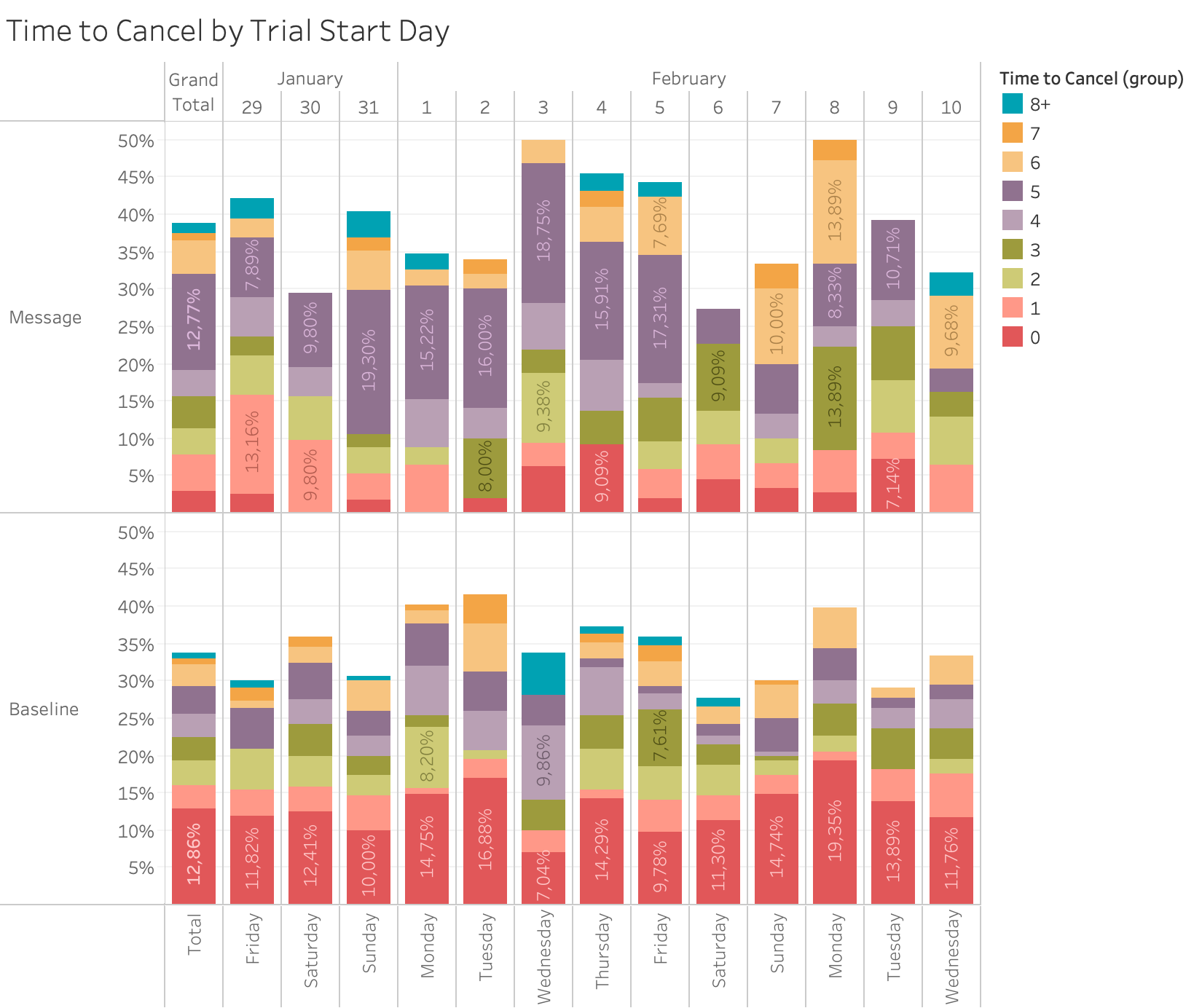
But the big question is what effect the notification would have once day 5 rolled around? Like Blinkist, Slopes saw a great opt-in rate for notifications. Around 75% of users starting the trial asked to be reminded on day 5. And like Blinkist, I saw my day-zero cancellations drop dramatically as people were willing to give the trial a proper go until the reminder came their way.
I also went ahead and tried out different notifications on day 5 depending on what you had done. If you recorded via Watch, for example, I tailored the notification to something about the great heart rate analytics users love and have them check out that premium feature.
But Slopes did not see the same 4% increase in trial -> paid conversions that Blinkist saw. In fact, it saw a 7.8% decrease over the two weeks I ran this test for those that requested the notification.
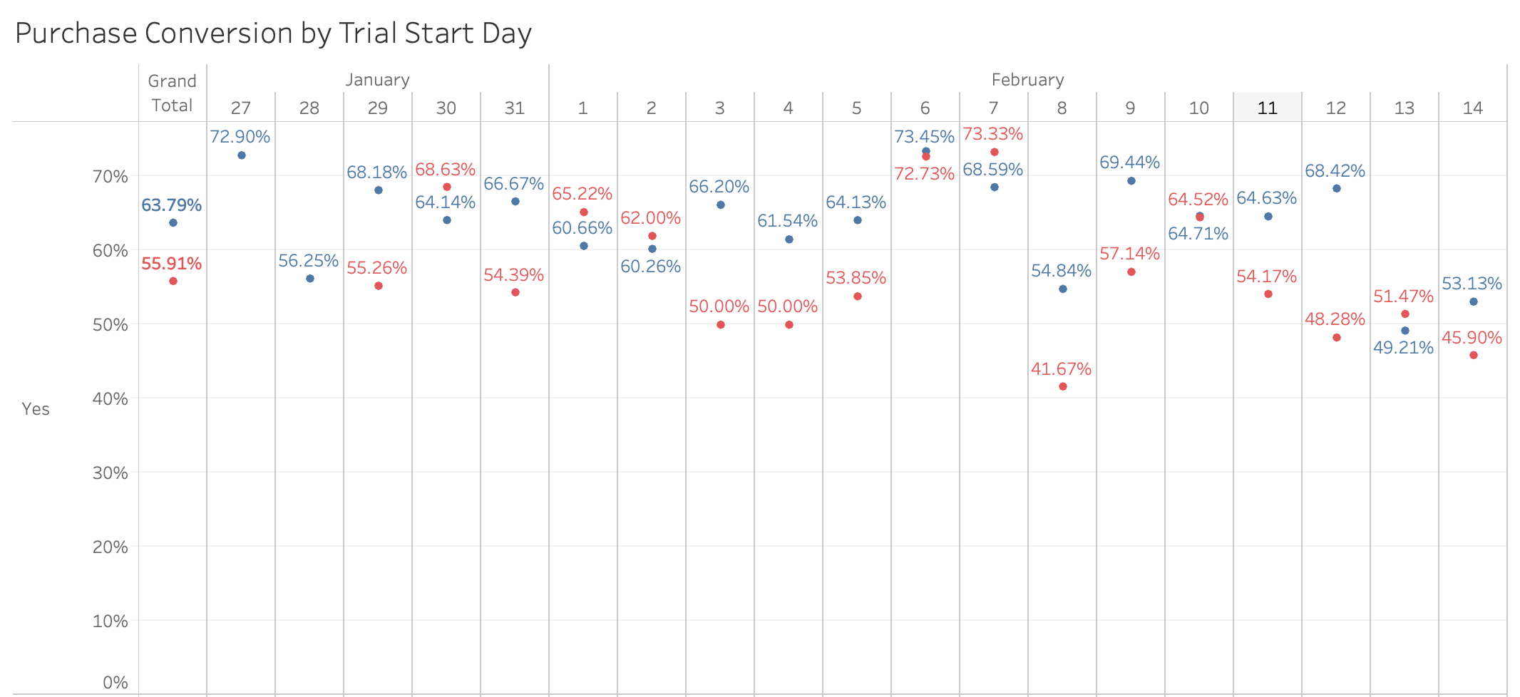
Oof. After 2 weeks I turned off the A/B test to stop the bleeding. I waited a bit to let refunds come in just incase this was helping on the back-side there before coming to conclusions (even though my refund rate is well under 1%, so I only get 1 per day out of hundreds of sales). Sadly through all this the A/B test users showed equal refund requests.
Additionally, in the test only 1 person turned auto-renew back on day 5 after having turned it off on day 0 (aka only one sale recovered).
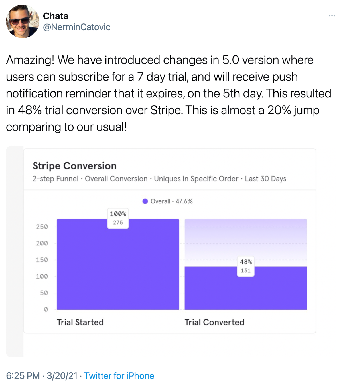
Since I tried this in Slopes I saw another person talk about using it in their own app, and they saw a positive outcome (much better than Blinkist's 4% jump, a 20% jump!):
So here's the thing: it is hard for me to do anything right now but scratch my head. There are multiple factors at play here, and I have my theories (beyond just "Curtis fucked up", which is always option A):
- Asking someone "are you sure you want this?" always runs the risk of them changing their mind. Not that they aren't happy, but they are re-evaluating the value a second time. The goal here is to make sure you're convincing more of those normal cancel-right-away people to stay than you are losing people who change their mind.
- So a core of this notification is making sure you can keep them engaged / show value over the whole trial, and using the notification as your last chance to get them back. You don't ask "hey do you still want this?" in the push, you prompt them to do something within your app related to the trial to show the usefulness one more time.
- Slopes is an app where people get the most out of it at a ski resort. There is minimal room for "re-engagement" outside of that – if you ski and then go home, you're not going to find the app nearly as valuable. So if I ask them to re-evaluate 5 days later when they are at home, Slopes feels less valuable. (plus maybe they just totaled up the bill from the ski trip lol)
- Maybe that means a 5-day trial is bad for Slopes + this push. Maybe a 3-day is better? That lines up better with trip lengths that they'd still be skiing, but then the push is kinda useless ("start your trial today, we'll remind you 24hrs before billing just to be safe, which is uhhhh tomorrow").
So yeah, I dunno. That's my current train of thought as to why it didn't work for Slopes. I really like the idea of building / earning user trust with this push method, but I need to go back to the drawing board and find a way that works for Slopes.
Regardless though, even though it was a bit of a flop for me, you should totally go try it in your app. I'm sure for many apps this is a great way to both increase trust and help convert more users. Just make sure when you send the push, you're sure to be in a better position to show/have shown your value than you were when they started the trial.