Slopes Diaries #42: Building Ramps, not Walls
Slopes Diaries is my ongoing journey to turn my indie app into a more sustainable part of my business. First time reading? Catch up on the journey so far.
What is Slopes? Think Nike+, Runkeeper, Strava, MapMyRun, etc for skiers and snowboarders.
There’s always a lot of talk about optimizing your paywall - hell, I usually redesign and test new version of mine at least once a season 😅. It makes sense that you'd focus so much on the paywall – it is a single screen that every purchase goes through, so the potential for impact is high.
Then once you are confident our paywall is performing OK you start to focus on where you show it. You'll start to make sure the UI has enough premium features visible in free mode that the user will likely tap something to launch the paywall. On and don't forget the common wisdom: show it during onboarding, get a ton of trials! And then randomly pop it up on launch sometimes, maybe with a special offer.
All roads lead to paywall.
But tunnel vision like this is dangerous in any situation. Fixating on the paywall as your main tool to convert people to subscriptions so much can leave you blind to other potential opportunities.
This is the first season the Slopes paywall went untouched, and yet we dramatically improved our year-over-year growth by focusing on everything but the paywall. In fact, for many users this season who purchased a subscription, they never saw a paywall at all ...
The “Trial Quickstart”
The idea for this came last summer: Ela had noticed Apple doing something interesting with Apple Arcade in the App Store, specifically how they presented the free trial:
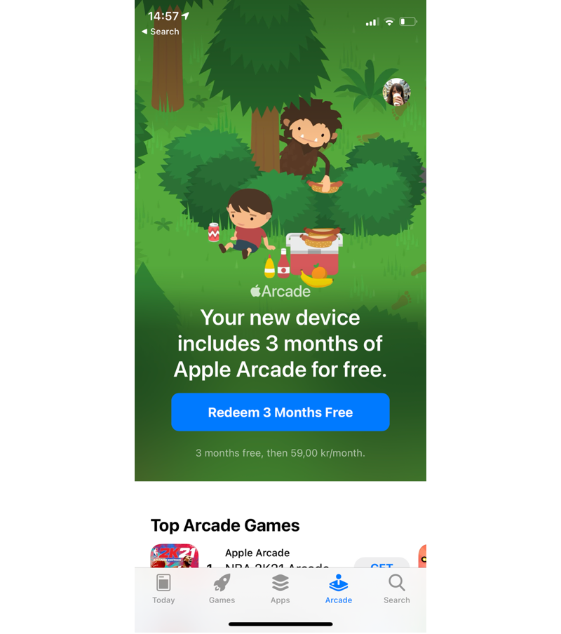
It isn’t a paywall at all! No “unlock now” or “see plans” or “learn more”, no popup with a feature list and other junk to add friction and cognitive load. Just a nice simple CTA with an appealing graphic. The phrasing here is interesting, too, and that was what made her take notice at first; it isn’t “here is a year subscription, oh and it has a free trial to lower risk” but rather “hey, it is your free trial, it is sitting here waiting to be used, why don’t you use it?”
Edit for clarification: This redeem button starts the IAP flow right there. No popup beyond the system one.
And thankfully, thanks to the changes Apple made a year+ ago where we don’t have to include a ton of boilerplate text along side IAPs, what Apple did is within the App Store guidelines for third party apps, too (minus their small font size choice for the pricing).
Eager to see how it’d perform we hooked up something similar in a few of the key upsell locations within Slopes, and let it run for the first 2 months of the winter 2021/22 season.
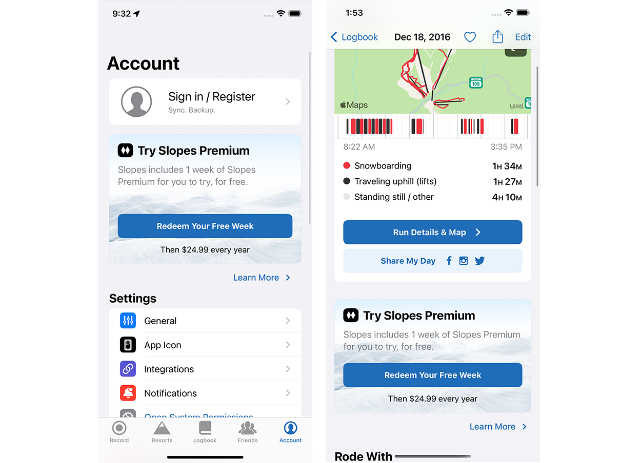
With this new “trial quickstart” we saw a 25% improvement in trial starts over the course of the A/B test, which mostly converted from trial -> paid at the same rate as before (so we weren’t just stuffing a funnel with bad candidates). We've gotten tons of comments that people didn't know how awesome Slopes Premium was until they tried it, so in retrospect putting walls between the user and Slopes Premium instead of ramps was just plain silly.
See, this works well because Slopes is now focusing on a CTA that is appropriate for where the user is in their own journey: they're curious but probably not ready to buy. With a standard paywall I'm focusing on what I eventually want them to do (convert to subscription). With this, I'm focusing on what I want them to actually do in the moment (try premium).
Aside: As a bonus, this approach solved another issue I’d had for a while: because Slopes offers one day + one week passes along side the subscription things always felt complicated. In the moment of purchase the user would have to do the mental math of which purchase made the most sense for them. We had also noticed that, since introducing the free trial over a year ago, even people who would eventually buy the day or week passes would usually redeem the free trial first anyway (back to the “why don’t you use it?” mentality). This new quickstart approach allowed us to focus on a single path on the journey and worry about the branching into different pass types after they tried it out to see if Slopes Premium was something they wanted.
Better UX = Better Sales? Who Knew. /s
While the quickstart trial was running, the next batch of changes in the sales process came from the redesign of the recording screen for Find-my-Friends (“Slopes: The Next Generation” as I called it), which I wrote about last time. For the first time in Slopes’s history there was a compelling reason to start Premium when you start recording at a resort - the premium maps w/ trail info. This is pretty big deal, but more on that in a second.
The UX gave us some better opportunities to highlight an existing Slopes Premium feature: run-by-run breakdowns while you record.
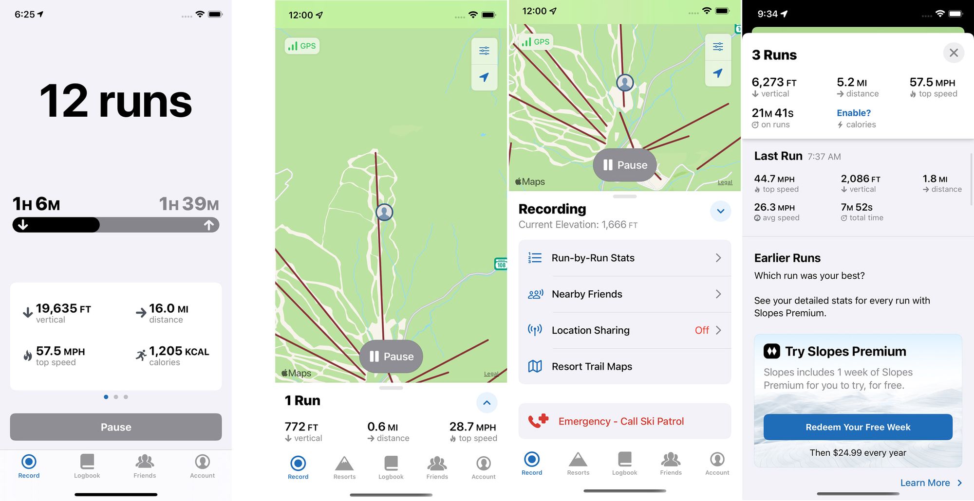
Before you’d have to notice this (left) was a pager and swipe over twice to get to a tiny little upsell CTA crammed in the little white box. Not very discoverable. But the new screen (right 3) really encouraged more exploration (the bottom card opens up automatically when they pause, like at lunch, for people who might not think to hit the expand button anyway).
So where the old version hardly got any trials from the recording screen, the new version has 10% of all trial starts in the app coming form the run-by-run breakdowns. Which is great because that also means people are actually finding this feature now.
Asking for the Sale
The third, and last, major change to how Slopes approached Premium this season might be the most revolutionary - actually asking for the sale.
Ela did a new-user journey walkthrough and noticed that the new recording UX, despite its improvements, didn’t mention Slopes Premium unless you happened to explore and find that run-by-run breakdown or if you hit the map layers icon to try to swap map types. While the new run-by-run visibility was great, the most valuable offering Premium has to offer while recording are those new maps, especially when you’re skiing with friends.
With the quickstart experiment going well by this point we decided to try something new - a quickstart popup when they start recording, but only if they are at one of the resorts we’ve built enhanced trail maps for.
I had always avoided any kind of do-you-want-premium popup here for two reasons: A) before this year there wasn’t anything of real, and more importantly easy-to-explain, value to offer and B) asking for a sale here was terrible timing as they’re likely rushing to get their gloves on and get on the lift. But the trial quickstart? That’s a very low risk choice that can be impulse decided. And the new maps? Super easy to visualize and “explain.”
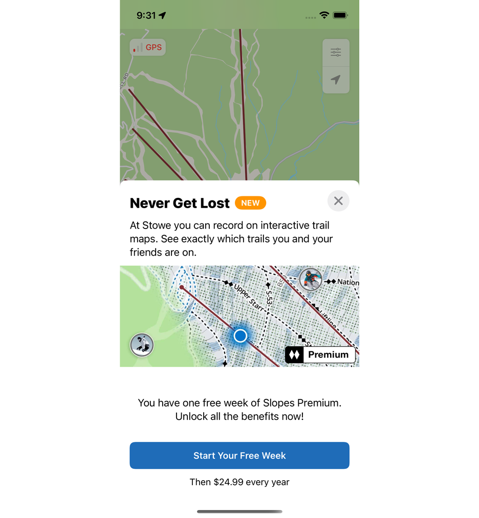
This rolled out to users at the ~30 resorts we initially had enhanced maps for, and then another 20 resorts towards the later season as we got maps in place for them. And we did this test right away without being hidden behind an A/B experiment (just kill switch); annoyingly the season was already in full swing when we thought of this and we didn’t want to delay further improvements as the season would be almost over by the time we’d have real numbers if we did an A/B.
How'd it go? We’re already seeing 10% of trials are come from this popup … which is only shown at only 50 resorts in North America 😅 (sample bias here: these are the bigger / more popular resorts, and NA is our strongest market, so these are the best target users. But still, huge bulk of trials from a very targeted part of the market). And it appears the popup isn’t just cannibalizing trial starts that would have occurred elsewhere …
Stacking Those Bricks
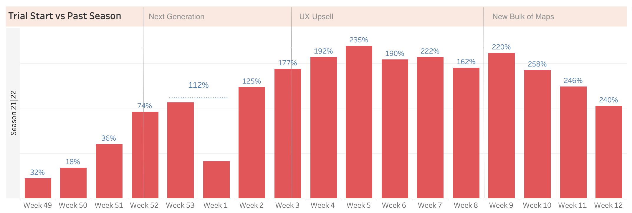
We didn’t have A/B experiments running for changes 2 (Next Generation) and 3 (Popup), so looking at the YoY trial start growth is a good way to see their effect. Change 2 doubled the trial YoY growth with the launch of the new maps screen, and then change 3 added that same volume of new trials again.
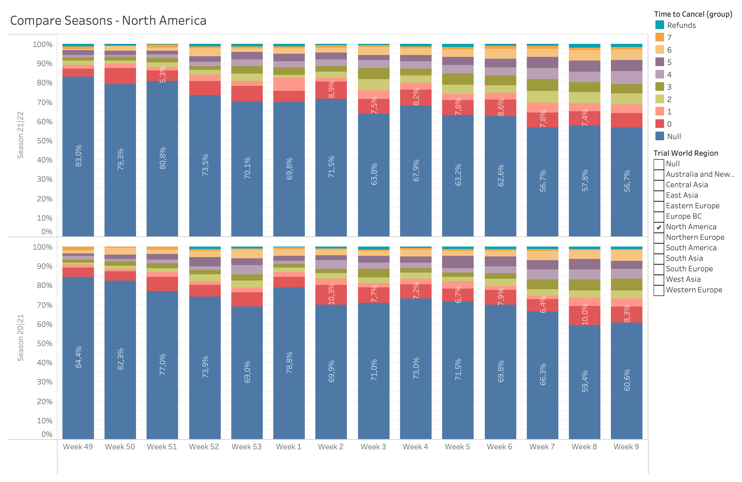
And no, don’t worry, this wasn’t a tunnel vision with a focus solely on trial starts. Conversions stayed healthy in North America, too, where the resorts with the trial quickstart popup all live. We always have a strong start to conversions trial -> paid that diminishes over the season users are less likely to ski again that season, and as we get more one-off trips in Jan/Feb for people:
The biggest potential risk of hurting conversion rates came with change 3, the trial popup, and we see that play out with a ~7% YoY drop in conversion when it went live (week 3 / 4). But considering we’re seeing 3x the trial starts … the math still works out in our favor.
It’s a balancing act of these two numbers, start of trial vs overall conversion, but I think we’re finding the right blend. It's good that we're not being as shy about trying to sell Slopes Premium "in the moment." I want to see if I can improve the conversion rate again next season, but I wouldn't be surprised if quite a good percentage of the trials that didn't convert this year will convert next year (pattern I see: try a week mid-season, end up converting next year in the beginning of the season when it is "worth" it.)
So what’s the end result here? Earlier in the season, before all the changes, trends were showing a 50-60% growth YoY. Now after all these changes we’re sitting on a 90% growth year (which would have been a 130%+ growth year had everything been in place since the beginning 😫).
But that’s great news, and all this is largely why Slopes blew past the $1mil ARR mark this season. 🥳